Understanding the differences in variability of your fields is crucial when planning your activities more efficiently, reducing losses, and achieving optimal crop development.
In Auravant, you can visualize a layer of information with 3 different types of scales:
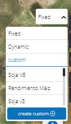
Fixed
Dynamic
Customized
They are configured with 3 types of color scales: Increasing – Decreasing and Specific
Increasing: The highest values are represented in green and the lowest values in red.
This type of color scale is used in layers of:
Harvest: (yield)
Planting: (dose)
Economics: (income; gross margin)
Soils: (altitude; OM; N; P; K; S; Mg; C; Mn; ClC; Fe; Zn; B; Depth; Clay; Silt)
Decreasing: The highest values are represented in red and the lowest values in green.
This type of color scale is used in layers of:
Harvest: (humidity, Speed)
Planting: (Speed)
Application (dose, Speed)
Economic (cost)
Soil (EC; Na; Ca; Al; Sand; Density)
Specific: The classification of these scales is based on layers that are specific, and the intervals are determined based on different agronomic criteria from various studies and user surveys.
Minimum values are represented in red, the ideal value of the layer is represented in green, and the high values are represented in blue.
This type of color scale is used in layers of:
pH
Fixed Scale
This type of scale is configured following a fixed range set between values -1; 0 and 1 in equal intervals. The values that make up a layer will be painted according to these intervals, where each color represents one of them.
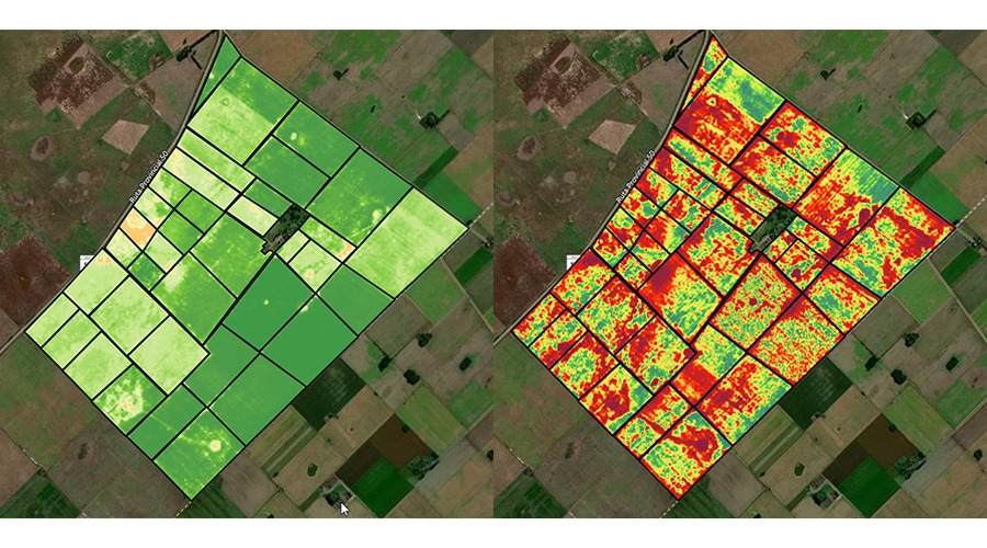
Dynamic Scale
The dynamic configuration takes the minimum and maximum values of the selected layer and colors them according to the value range of your layer.
For example: if when selecting a layer all its values are high, by selecting the dynamic scale, you will observe those same values colored in a way that represents a greater variability of the data that make up the layer.
This type of scale is very useful for taking corrective or preventive measures both when planning the execution of future tasks and in field visits with the mobile app.
This way, you will obtain a greater interpretation of the indexes and observe more accurately what, otherwise, would go unnoticed.
Customized Scale
In this section, you can configure the parameters for each of the layers. This type of scale allows producers and advisors to establish the same analysis criteria for all fields based on their knowledge of the field and crops.
How to create your custom template?
1- Select the scale type and click on “Create Custom”.
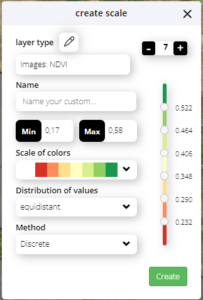
2- Once clicked, a box will appear where you can start defining your template.
3- Name your scale and choose the color palette with which you want to visualize it.
4- Define the number of intervals you want, selecting the “+” and “-” signs. Keep in mind that the minimum number of intervals available is 3 and the maximum is 7, they are managed with the points of each color and can be configured manually by editing the value.
5- When finished, select “Create”. It will be available to view in the layer in a pre-established way. (Ex: Every time you enter layer “P_20”, you will see this configuration).
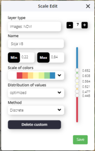
Select template/Edit template
When we select a template in the scale viewer, the % of surface of each interval will appear and a pencil icon corresponding to “Edit”.
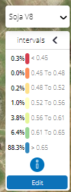
By selecting “edit” you will be able to modify the following variables:
Template Name: edit name.
Color Scale: selected color.
Interval Distribution: (in case of choosing a quantile or equidistant interval and modifying it, “manual” will appear).
Finally, you will have the option to “save” or “delete custom”